2/18/26
SHOWIT HOMEPAGE TRANSFORMATION: LOVE YOGA’S JOURNEY FROM WORDPRESS GRID TO EDITORIAL DESIGN

The Brief: “We Need Space to Breathe”
In Part 1, I explained why I switched platforms. Now let me show you a real Showit homepage transformation in action—how Love Yoga went from WordPress grid prison to editorial freedom.
Love Yoga, a wellness studio in Singapore, came to me with a common frustration: their WordPress theme looked “like every other yoga website.” The hero image was trapped in a box. The services were locked in identical cards. The instructor bios were spreadsheet-like. They wanted editorial, calm, designs that breathe—but the theme kept snapping everything back to 12-column grids.
The breaking point came when the owner tried to move one image 20px to the right to create asymmetry. The theme autocorrected it. Three hours later, she emailed me: “Can we just start over?”
The “Before”: WordPress Grid Prison
The Navigation Overwhelm
Seven items: Home, About Us, Classes, Instructors, Community, Blog, Contact.
Decision paralysis. Every item screamed for attention equally. The WordPress menu couldn’t establish visual hierarchy—everything was just listed in a horizontal bar.
The Hero Box
The hero image was trapped in a 1200px container, centered, with equal padding on both sides. No bleed. No drama. The headline sat in a white box over the image, blocking the actual yoga studio atmosphere. The design felt like looking through a window rather than stepping into a space.
The Service Grid Lock
Group Classes | Private Sessions | Workshops—three identical boxes, equal height, equal width. The WordPress theme required symmetry even though “Group Classes” had ten lines of description and “Workshops” had three. Result: awkward white space or cramped text. No winning.
The Instructor Spreadsheet
Six instructors locked in a 2×4 grid like employee IDs. Identical photo dimensions. Uniform spacing. Predictable rows. No personality. No editorial “scatter.”
The “After”: Showit Editorial Freedom
Navigation (Seven Items → Four Paths)
Consolidated to: About, Offerings, Teachers, Connect.
The WordPress “Classes,” “Instructors,” “Community,” and “Blog” were consolidated under logical umbrellas. Fewer decisions equal clearer journey. The navigation became a whisper, not a shout—visible but not competing with the visual experience.
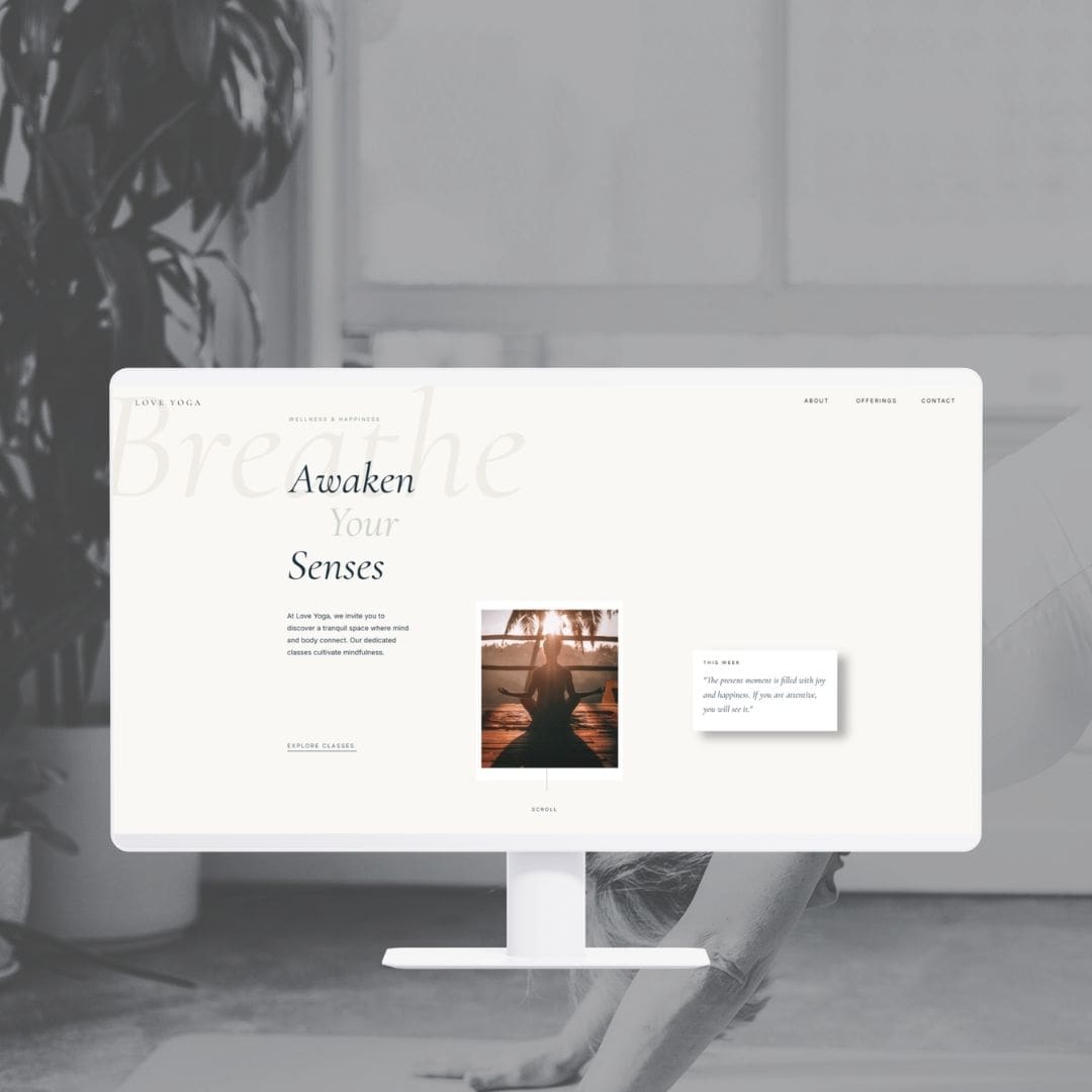
The Asymmetric Hero
The headline “Awaken Your Senses” anchors the left side while two image elements float asymmetrically in the center-right space, creating an editorial composition impossible in WordPress’s rigid container blocks.
Behind everything, massive “Breathe” text at 20% opacity creates depth without distraction. The eye travels: first the headline (left), then the two floating boxes (center-bottom). It’s editorial rhythm.
Philosophy Section (The 60/40 Split)
Instead of the standard 50/50 split, the image takes 60% and bleeds left. A massive “01” number in light gray sits behind the text as a graphic element. The text floats in the remaining 40% with generous asymmetric padding. This creates visual “inhale/exhale”—the space itself becomes content.
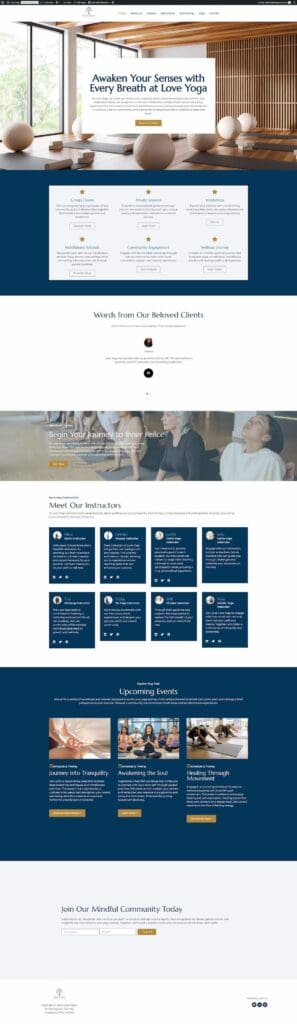
Services (Breaking the Three-Column Prison)
Editorial alternation instead of grid:
- 01 Community Flow: Image left (bleeding), content right
- 02 Personalized Guidance: Image right (bleeding), content left
- 03 Mindfulness Escapes: Image left (full-bleed), content overlaid
Instructors (The Scatter Grid)
The WordPress limitation: Grid systems force equal sizing. Six instructors in a 2×4 formation—same dimensions, same spacing.
The Showit solution: Absolute positioning on a 1200px canvas. Each instructor card placed individually—some larger, some smaller, some overlapping. Judith sits forward (z-index 4) and overlaps Alice behind her. Judy recedes (z-index 1) creating depth. Tim and Yoko stagger at the bottom.
The result looks like a curated mood board, not a database query. In a wellness context, teachers are individuals, not inventory. The scattered composition reflects their unique personalities—some commanding attention, others quietly present.
The Technical “How” (No Code Required)
Canvas vs. Container
WordPress thinks: “Which pre-defined section do you want?” Showit thinks: “What do you see in your head?”
The Love Yoga hero image isn’t “aligned right in a container.” It’s positioned at Right: -100px on a canvas. The text box isn’t “padding: 40px.” It’s Bottom: 150px, Left: 80px—floating in space.
Absolute Positioning for the Scatter
The instructor “grid” isn’t a grid. It’s six separate image elements with X/Y coordinates. In WordPress, this would require custom CSS for each card, media queries for responsive, and JavaScript for hover states. In Showit: Drag. Drop. Done.
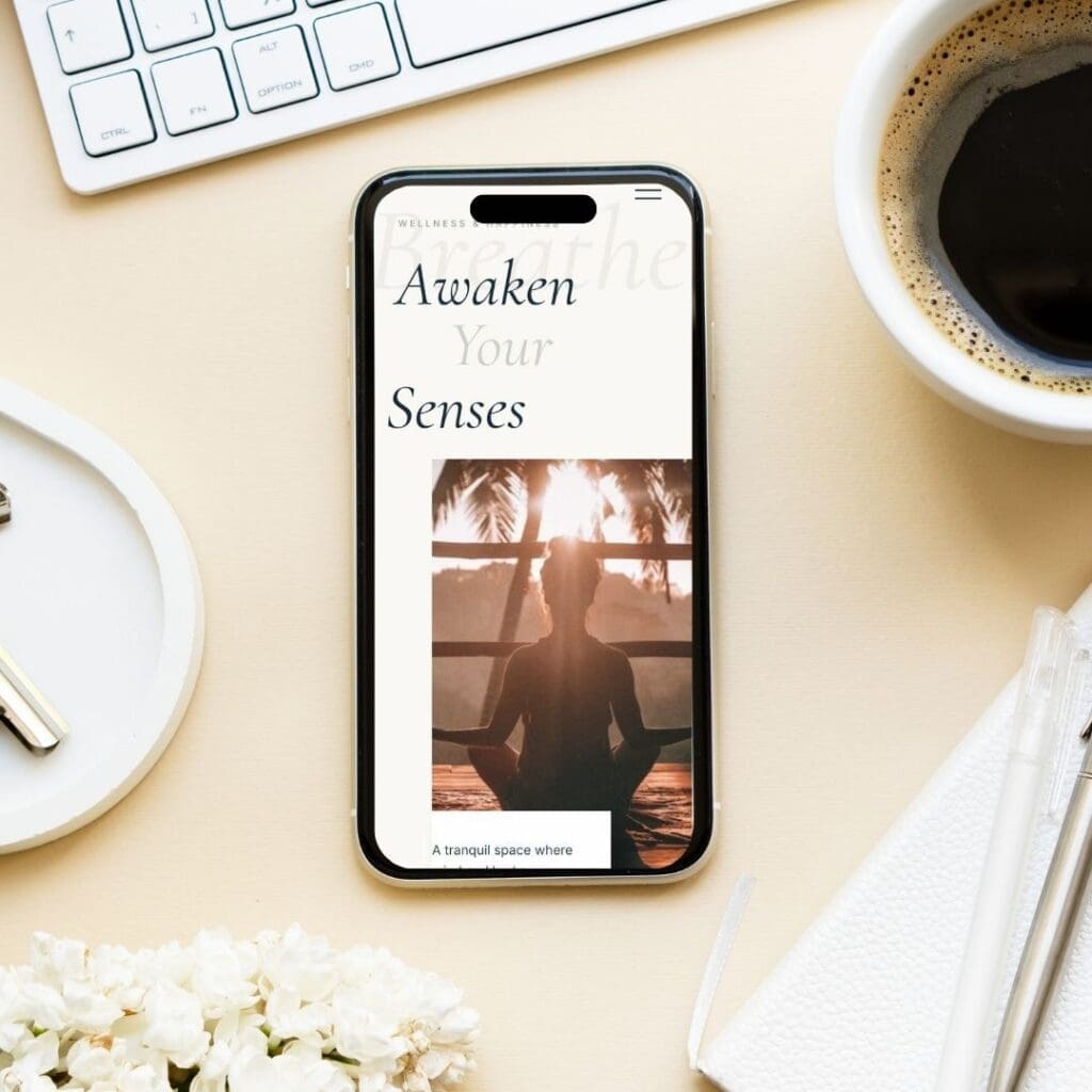
Mobile as Separate Canvas
WordPress mobile equals desktop stacked vertically. Showit mobile equals completely redesigned 320px canvas. For Love Yoga’s mobile homepage, I didn’t shrink the desktop—I redesigned it: vertical stack of hero elements, single-column services, 2-column instructor grid instead of scatter. Same brand, different composition optimized for the device.
The Business Result
Client autonomy became reality. The Love Yoga owner can change the hero quote, swap instructor photos, or update class schedules herself—without touching code or waiting for developer availability. In WordPress, these “minor” edits would have meant submitting a ticket, waiting 48 hours, and paying hourly maintenance fees. Now she edits in seconds on Showit’s visual canvas, and the layout stays intact.
Maintenance time evaporated. No more monthly plugin update marathons, no compatibility checks between Elementor and Yoast, no panic when a PHP update breaks the theme. What used to consume 4-6 hours of my monthly retainer (and her budget) simply doesn’t exist on Showit. The flat subscription covers everything; the canvas just works.
When the design breathes, visitors stay longer. The asymmetric layout and editorial spacing increased time-on-page significantly compared to the boxed WordPress version. Readers scroll slower through the Services section because the alternating layout creates curiosity. They linger on the Instructor Gallery because the scattered composition mimics browsing a curated magazine rather than scanning a database. The design itself becomes the conversion tool—no pop-up plugins required.
Launch speed accelerated. From signed contract to live site: 3 weeks on Showit versus the 8-10 weeks typical of my WordPress builds. Fewer technical bottlenecks meant more time spent on actual design decisions—the typography, the image curation, the spacing that makes a wellness brand feel like a sanctuary rather than a service list.
What’s Next
The homepage sets the editorial tone, but the Services page is where browsers become buyers. In Part 3: The Nail Bar Services Page Transformation, I’ll show you how to break complex service menus out of dropdown hell and into editorial clarity—using a completely different brand to prove these principles work across industries.
Frequently Asked Questions
Decision paralysis kills conversions. Seven competing menu items became four clear paths: Learn (About), Browse (Offerings), Connect (Teachers), Contact. Fewer choices mean faster decisions and clearer user journeys.
Yes. The hero headline, detail box text, and instructor photos are all editable via Showit’s visual canvas. The client changes content; the positioning and spacing remain locked. Unlike WordPress where editing might break container padding, Showit preserves the design structure while allowing updates.
Showit doesn’t support text stroke natively. Rather than forcing it with custom CSS, I used sage green (#8b9d83) from the wellness brand palette. It creates visual hierarchy against the navy headline while working within platform constraints.
Absolute positioning requires intentional hierarchy. Judith sits at z-index 4 (front) as lead instructor. Judy recedes to z-index 1 creating depth. The scatter follows a diagonal flow, guiding the eye naturally. In WordPress this would be a spreadsheet grid; in Showit it’s a curated composition.
From WordPress export to Showit launch: 2.5 weeks. Week 1: content audit and wireframing. Week 2: image curation, absolute positioning, and mobile canvas. Final days: content population and launch. A comparable WordPress build with this custom layout would require 6-8 weeks including CSS troubleshooting.


