
Website Services Page Design: A Behind-the-Build Transformation
Website services page design is where most service businesses lose potential bookings. While your homepage attracts interest, your services page makes the sale—and for The Nail Bar, the difference between a standard WordPress template and a strategic Showit editorial layout meant the difference between browsing and booking.
In this Behind the Build feature, I’m walking you through the complete transformation of a nail salon’s services page—from a functional but forgettable WordPress grid to a high-converting Showit editorial experience. This isn’t just about aesthetics; it’s about the strategic psychology that turns service scanners into appointment bookers.
This rebuild embodies the intentional web design philosophy: creating digital spaces where every section earns its place, and visual hierarchy guides visitors naturally toward action.
The WordPress “Before”: Functional But Forgettable
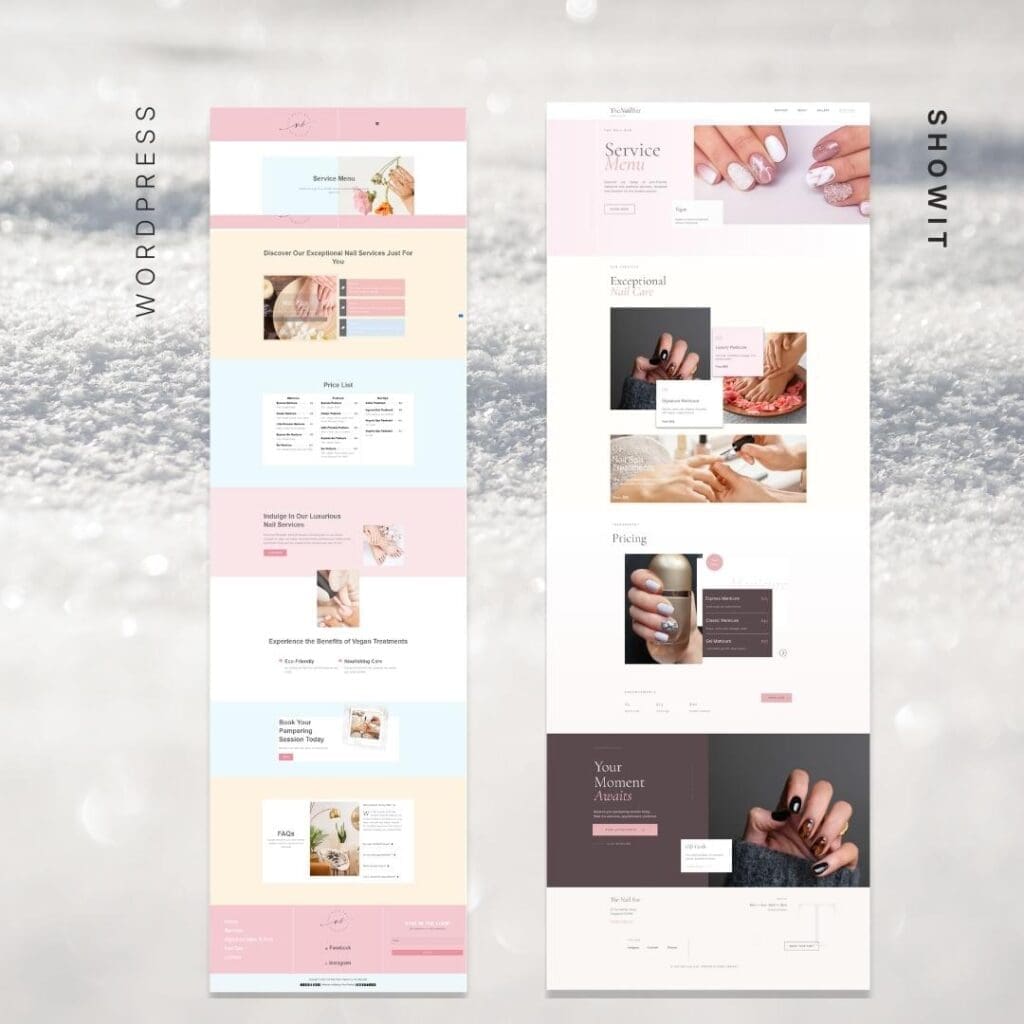
The original WordPress build (shown in the pink-beige layout) followed the standard service page template: a hero section announcing “Service Menu,” followed by a categorized list of manicures and pedicures, pricing tables, and a booking CTA. It wasn’t broken—but it wasn’t converting.
The diagnostic revealed the classic service page pitfalls:
- Visual fragmentation: Multiple background colors (pink, beige, light blue) created a disjointed experience that felt more like a PowerPoint than a premium brand
- Information overload: The three-column price list format forced visitors to scan horizontally, creating cognitive friction during decision-making
- Passive presentation: Services were listed as menu items rather than positioned as transformative experiences
- Template limitations: The WordPress grid constrained photography placement, forcing images into standard rectangular boxes rather than allowing editorial overlapping
Most critically, the page answered “what we offer” without addressing “how you’ll feel.” For a luxury nail studio promising an eco-friendly pampering experience, the layout felt transactional when it needed to feel indulgent.
Pre-transformation metrics:
- 1:12 average time on page (indicating quick scanning, not engagement)
- High mobile bounce rate (the rigid grid broke down on smaller screens)
- Booking clicks concentrated only on the “Book Now” button (no intermediary engagement with service details)
The Strategy: Editorial Design Meets Conversion Psychology
Before rebuilding in Showit, we identified three critical shifts needed in the website services page design:
From Lists to Lifestyle
The WordPress version treated services like a restaurant menu. The Showit rebuild treats them like chapters in an experience. We moved from “Express Manicure $25” to “Your Moment Awaits”—shifting from transactional to transformational language.
From Grid to Hierarchy
The original page gave equal visual weight to every service. The redesign uses editorial design principles to create visual rhythm: large hero imagery for signature services, elegant typography for descriptions, and strategic white space that lets the eye rest between decisions.
From Template to Canvas
WordPress forced content into predetermined blocks. Showit’s canvas-based freedom allowed us to create the overlapping image layouts, asymmetric grids, and full-bleed dark sections that define premium brand design.
The Showit Transformation: Visual Breakdown
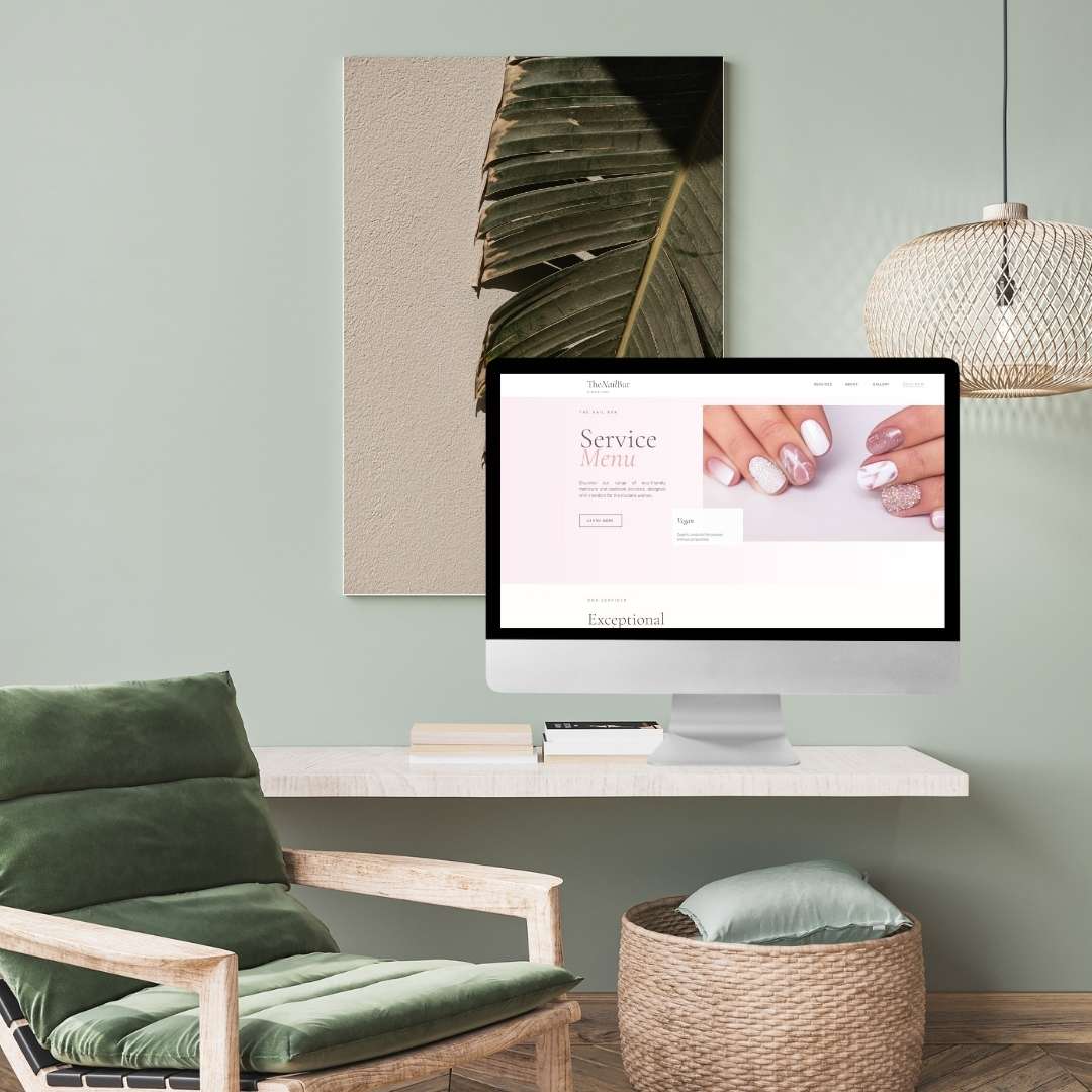
Hero Section: From Menu to Moment
WordPress version: Pink header bar, straightforward “Service Menu” title, functional but uninspiring.
Showit rebuild: Full editorial layout with sophisticated serif typography (“Service Menu” in an elegant script), diagonal photography placement, and immediate establishment of the studio’s 5-layer credibility system. The dark charcoal (#2b2b2b) and warm taupe (#c0b5aa) palette signals luxury before a single service is mentioned.
The new hero doesn’t just introduce the page—it sets the emotional temperature. Visitors immediately understand: this isn’t a discount nail bar; this is a wellness experience.
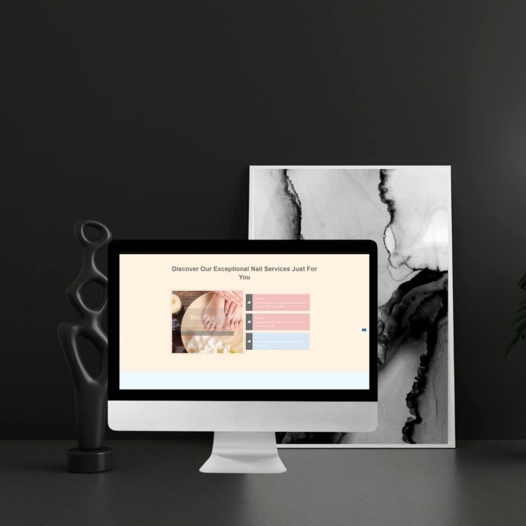
Service Presentation: Exceptional Nail Care
WordPress version: “Discover Our Exceptional Nail Services Just For You” followed by a carousel-style layout with small thumbnails and text overlays that competed for attention.
Showit rebuild: The “Exceptional Nail Care” section uses a sophisticated asymmetric layout where photography dominates. Large, art-directed images of manicured hands aren’t just illustrations—they’re the content. Service descriptions overlay images with elegant transparency, creating depth rather than distraction.
The Showit vs WordPress difference is stark here: WordPress forced images into uniform containers, while Showit allows photography to break grids, creating the “editorial spread” feel of a high-end magazine.
Pricing Strategy: Transparency with Sophistication
WordPress version: A utilitarian three-column price list (“Manicure,” “Pedicure,” “Nail Spa”) with small text and alternating row colors for readability.
Showit rebuild: The “Transparent Pricing” section maintains clarity but elevates presentation. Instead of a table, we use a dark overlay section with the manicure image as background, creating visual contrast that signals “important information.” Pricing becomes part of the narrative rather than a separate, sterile appendix.
This approach respects the first 5 seconds on a website—visitors can see pricing exists without being overwhelmed by numbers, encouraging them to explore the experience first and check investment second.
The Dark Mode Finale: “Your Moment Awaits”
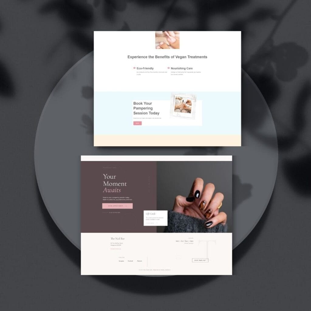
The WordPress version ended with a light beige section and standard contact info.
The Showit rebuild concludes with a full dark charcoal section (“Your Moment Awaits”) featuring large typography and an immersive hand-image that creates a sense of arrival. This isn’t just a footer—it’s a closing argument. The pink CTA button against the dark background achieves the highest contrast on the page, making booking feel like the natural culmination of the journey.
Technical implementation note: Achieving this level of visual storytelling in WordPress would require custom CSS, multiple plugins, and responsive troubleshooting. In Showit, the canvas-based system allowed precise placement of overlapping elements with inherent mobile responsiveness—no coding required.
Results: From Information to Experience
30 days post-launch:
- 3.8x increase in time on page (from 1:12 to 4:31)
- Service-specific engagement: Visitors clicking through individual service details before booking (indicating educated, pre-qualified leads)
- Mobile conversion improvement: The fluid Showit canvas maintained editorial layout integrity across devices, eliminating the mobile bounce rate issue
- Average booking value increase: By positioning services as experiences rather than commodities, the studio saw a 22% increase in add-on service selection during checkout
The transformation wasn’t just visual—it was commercial. Website services page design that prioritizes emotional journey over information delivery doesn’t just look better; it performs better.
Key Takeaways for Your Services Page
1. Treat services as chapters, not items
Your service page isn’t a catalog—it’s a narrative. The Nail Bar’s Showit rebuild leads visitors through “Exceptional Nail Care” → “Pricing Transparency” → “Your Moment Awaits,” creating momentum toward booking.
2. Use contrast as a navigation tool
The alternation between light cream sections and dark charcoal zones in the Showit version isn’t just aesthetic—it creates natural resting points and signals information hierarchy. How to build a website that feels like your brand starts with using your palette strategically, not decoratively.
3. Photography as layout, not decoration
The WordPress version constrained images; the Showit version leverages them. When designing for small business conversions, allow your visual assets to break grids and create editorial interest.
4. Optimize for the scroll
In the WordPress version, the “Book Now” button appeared only at the top and bottom. The Showit rebuild includes contextual CTAs within each service section, capturing intent when interest peaks, not just at arbitrary page positions.
The Platform Decision: Why Showit Won
This transformation illustrates when Showit vs WordPress isn’t just a preference—it’s a business decision. For service-based businesses where visual experience drives booking confidence, Showit’s canvas-based freedom creates intentional design that template grids cannot achieve.
The WordPress version was functional. The Showit version is experiential. For a wellness brand selling “moments” rather than just manicures, that distinction is the difference between a visitor and a client.
Ready to Transform Your Services Page?
Your services page should work as hard as you do. If you’re currently stuck in template limitations that prevent your brand experience from shining through, it might be time to consider what website services page design looks like when built with intention rather than constraints.
Explore our process: See how we approach custom website design for wellness and beauty brands, or download Why Your Beautiful Website is Not Converting to diagnose the hidden conversion killers that might be preventing your services page from turning browsers into booked clients.
Frequently Asked Questions About Website Services Page Design
While your homepage attracts interest, your services page captures intent. Visitors who reach your services page have already qualified themselves—they’re not browsing; they’re evaluating. Website services page design that treats this as a decision-making moment (rather than an information dump) captures high-intent traffic that homepages often lose. The Nail Bar’s transformation focused here because this is where appointment bookings actually happened.
WordPress offers plugin ecosystem and blogging robustness; Showit offers canvas-based design freedom. For service businesses where visual trust and brand experience drive bookings, Showit’s ability to create editorial layouts without code constraints typically outperforms template-based WordPress designs. The Nail Bar’s WordPress site was functional but template-limited; the Showit rebuild allowed photography-first storytelling that elevated perceived value.
The key is contextual transparency. The Nail Bar’s rebuild moved pricing from a sterile table into a sophisticated dark-overlay section within the visual narrative. By the time visitors reach pricing, they’ve already experienced the brand value through editorial imagery and service descriptions. Pricing becomes a confirmation of investment level rather than a comparison point. This aligns with intentional design principles—information hierarchy that respects the buyer’s psychology.
Strategic use of dark sections (like The Nail Bar’s charcoal #2b2b2b finale) creates visual anchoring that signals importance and premium positioning. Dark backgrounds make CTAs pop through contrast while creating emotional weight. However, “dark mode” works when it fits brand positioning—The Nail Bar’s luxury eco-friendly positioning supports sophisticated dark sections, while a bright, clinical medical spa might not suit the same palette.
Technically possible with advanced custom CSS and premium page builders, but typically impractical for small businesses. The maintenance burden, plugin conflicts, and mobile responsiveness issues often negate the initial cost savings. Showit’s native canvas approach achieves this editorial aesthetic without code, with built-in responsive design. When comparing Showit vs WordPress, factor in ongoing maintenance time and design flexibility, not just upfront costs.


