1/12/26
SERVICE PAGE DESIGN: THE HIGH-CONVERTING STRUCTURE SMALL BUSINESSES NEED

Your Services page doesn’t need to be long. It doesn’t need to be “clever,” either. It just needs to make it easy for the right person to think, “Yes—this is exactly what I need,” and then take the next step.
That’s what strong service page design does.
It guides visitors from interest → trust → clarity → action… without sounding salesy, pushy, or like you borrowed someone else’s personality.
In this post, I’m giving you a proven layout you can copy section by section—plus paste-ready copy prompts—so your Services page feels confident, calm, and easy to book from.
Also, if you want the “why” behind this structure, you’ll love What “Intentional Design” Actually Means for Small Business Websites for the deeper strategy.
Why service page design breaks (even on beautiful websites)
A lot of service pages look polished, yet they still don’t convert. Usually, it’s not a pricing issue. It’s not even a “traffic” issue. Instead, it’s a clarity issue.
1. Your page looks good, but it doesn’t guide decisions
When visitors can’t quickly figure out what you do, who it’s for, and what to do next, they hesitate. And when people hesitate, they click back.
2. The next step feels hidden (or weirdly vague)
If your main button says something generic like “Get Started,” people may click… then feel confused. Nielsen Norman Group explains that vague CTAs can mislead users and slow them down because they don’t clearly signal what happens next.
3. You lead with features, so visitors don’t feel the outcome
Deliverables matter, of course. However, most people decide based on outcomes:
- What will improve after I book?
- What becomes easier?
- What problem stops taking up space in my brain?
If your page doesn’t answer those questions early, visitors keep scrolling… and keep doubting.
What high-converting service page design actually does
Think of your Services page as a guided path. Great pages help visitors answer five questions, in this order:
- Am I in the right place?
- Is this for someone like me?
- Can I trust you?
- What happens if I say yes?
- How do I book (simply)?
This is also why “people-first” content wins long-term. Google explicitly recommends creating content for people first, rather than content made mainly to rank.
So yes—this structure supports conversions. And yes—it supports SEO, too, because the page becomes genuinely useful.
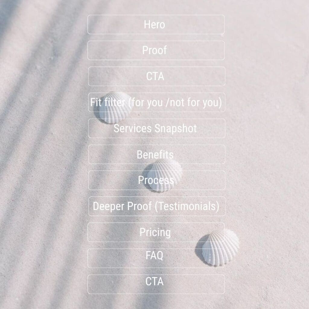
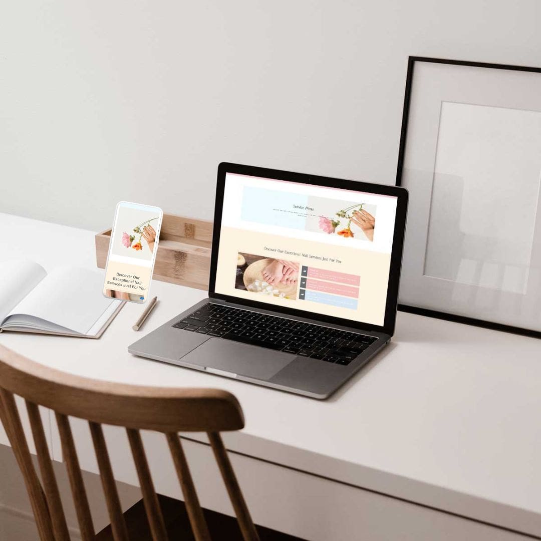
The high-converting service page design layout (section by section)
Below is the exact order I recommend for most small business service pages. You can adjust later, but start here first.
Section 1 — Hero (clarity + direction)
Goal: Make the offer obvious, fast.
Your hero section has one job: make your service obvious and make the next step easy.
So instead of trying to sound impressive, aim to sound clear. Then, once your reader thinks “this is for me,” they’re ready to click.
Hero headline options (pick ONE and customise)
Choose the headline style that fits your brand voice. Replace the bracketed words with your offer details.
- [Service] for [Audience] who want [Outcome].
- Get [Outcome] without [Pain Point].
- A calmer way to [Desired Result].
Examples (so you can see how it sounds):
- Facial treatments for sensitive skin that needs calm and clarity.
- Get clearer skin without trial-and-error products.
- A calmer way to feel confident going makeup-free.
Add 2–3 micro-bullets under the headline:
- “Best for [ideal client]”
- “Timeline: [range]”
CTA button ideas (pick one main CTA):
- Book an appointment
- Check availability
- Request a quote
- View packages
Tip: Keep this button consistent across the page. Consistency feels safe.
Section 2 — Proof near the top (instant trust)
Goal: Reduce skepticism early.
Choose one “trust stack” (don’t overdo it):
- “Trusted by [number] + clients” and one short testimonial line
- “Featured in / Certified in” (only if true)
- A single results line (if you track it)
Proof examples you can place near the hero:
- “4.9★ average rating from 200+ clients”
- “As seen in [publication]” (only if true)
- A one-line testimonial: “My skin calmed down within a week.”
Why so early? Because people follow cues (what UX calls “information scent”) to decide where to click next. The clearer the cues, the easier the decision.
Section 3 — Fit filters (“for you / not for you”)
Goal: Help ideal clients self-select quickly (and reduce mismatched inquiries).
This is for you if…
- You’re [scenario] (Example: You’re dealing with recurring breakouts, sensitivity, or congestion)
- You want [outcome] (Example: You want a plan, not a one-off treatment)
- You’re ready for [commitment] (Example: You value a calmer, professional approach)
This is not for you if…
- You need [out-of-scope item] (Example: You need dermatologist-level care)
- You want [misaligned expectation] (Example: You want instant results overnight)
- You’re shopping for the cheapest option
This section feels bold, but it saves you from messy leads later.
Section 4 — Offer snapshot (what’s included)
Goal: Make the service tangible.
Use a clean list:
- Deliverables (“What you get”)
- Boundaries (“What’s not included”)
- Options (“Choose 1 of these add-ons”)
Section 5 — Benefits first, features second
Goal: sell outcomes, then support with details.
Benefits (reader language):
- “Calmer skin that feels less reactive”
- “Fewer ‘what should I book?’ doubts”
- “A plan you can actually follow”
Features (supporting details):
- 60-minute session
- Suitable for sensitive skin
- Product guidance included
Section 6 — Process (reduce uncertainty)
Goal: remove anxiety by making the steps predictable.
Example process (3–5 steps):
- Book your session
- Quick consultation + skin check
- Treatment + targeted approach
- Aftercare plan
- Review + next-step recommendation (if needed)
Section 7 — Deeper proof (testimonials/results)
Goal: let others do the convincing.
Strong testimonial prompts (what to look for):
- Before → after (“I stopped getting painful flare-ups…”)
- Experience (“She explained everything clearly…”)
- Outcome (“My skin texture improved in 3 weeks…”)
If you have them, add one mini case snippet:
- “Concern → approach → result” in 3 lines.
Section 8 — Pricing approach (without boxing yourself in)
Goal: reduce price anxiety, keep it flexible.
Example pricing styles:
- Starting from: “Treatments start from $___ (final cost depends on concerns + add-ons).”
- Range: “Most clients invest between $–$ depending on treatment plan.”
- Packages: “Starter / Maintenance / Transformation”
Section 9 — FAQs (remove hesitation)
Goal: answer “small doubts” right before the decision.
Examples of FAQs that actually convert:
- “Is this suitable for sensitive skin?”
- “How many sessions do I need?”
- “What should I do before my appointment?”
- “Can I reschedule?”
- “Do you offer packages?”
Place FAQs after pricing and before your final CTA. That’s where doubts tend to spike.
Section 10 — Final CTA block (one clear next step)
Goal: make action feel easy and low-pressure.
Include:
- One calm reassurance line
- One CTA button
- Optional: a secondary contact method (email) if you want
Example CTA copy:
“Not sure what to book? Start with a consultation and we’ll recommend the best option for your skin.”
CTA button: Book an appointment
Secondary link (optional): View packages
Mini service page design examples (wellness/beauty studios)
Example A — Facial studio (single signature offer)
Hero: “Signature Facial for stressed, reactive skin—calm in one session.”
Proof near top: “4.9★ average rating” + 1 testimonial line
Fit filters: “Best if you’re dealing with congestion, redness, or barrier stress.”
Offer snapshot: “What’s included + aftercare”
Process: “Consult → cleanse → gentle extractions → calming mask → home plan”
CTA: “Book your session”
Example B — Pilates studio (packages)
Hero: “Pilates packages built for consistency (not overwhelm).”
Offer snapshot: Starter / Momentum / Strong
Benefits: “Feel stronger, move better, stay accountable.”
Proof: “What members noticed after 4 weeks…”
FAQ: “Can I reschedule?” “Is this beginner-friendly?”
CTA: “Check class availability”

Service page design checklist (before you publish)
- Your hero says what you do + who it’s for + outcome
- Your primary CTA is visible quickly (ideally near the top)
- You add proof near the top (even a small line helps)
- You include “for you / not for you” filters
- Benefits show up before features
- Your process has 3–5 clear steps
- Your pricing approach reduces anxiety (even if it’s a range)
- FAQs appear after pricing, before the final CTA
- You repeat one main CTA 2–3 times (not 10 different buttons)
- Every section earns its place (no filler blocks)
If you want another conversion-focused read: Why Your Beautiful Website Is Not Converting
FAQ
A high-performing Services page includes a clear hero, a direct CTA, proof near the top, fit filters, offer details, benefits, process, pricing approach, FAQs, and a final CTA.
Long enough to answer real questions, and short enough to stay easy to skim. If your offer is higher-ticket or custom, you’ll usually need more proof, more process clarity, and stronger FAQs.
If you can, yes. Even a starting price or range reduces friction and filters out mismatch leads. If pricing varies, explain what affects it and give a typical range.
Use a specific action like “Book a consult,” “Check availability,” or “Request a quote.” Avoid vague CTAs like “Get Started,” which can confuse users about what happens next.
Put a short proof snippet near the top, then add deeper testimonials or a mini case study after your process or before pricing.
Yes. Keep the same section order for consistency, then tailor the copy, proof, and FAQs to each offer.


