1/06/26
HOMEPAGE DESIGN: THE SECTION ORDER THAT GETS SMALL BUSINESS INQUIRIES

A homepage can look beautiful and still feel… quiet in the wrong way.
Not calm. Not intentional. Just unclear.
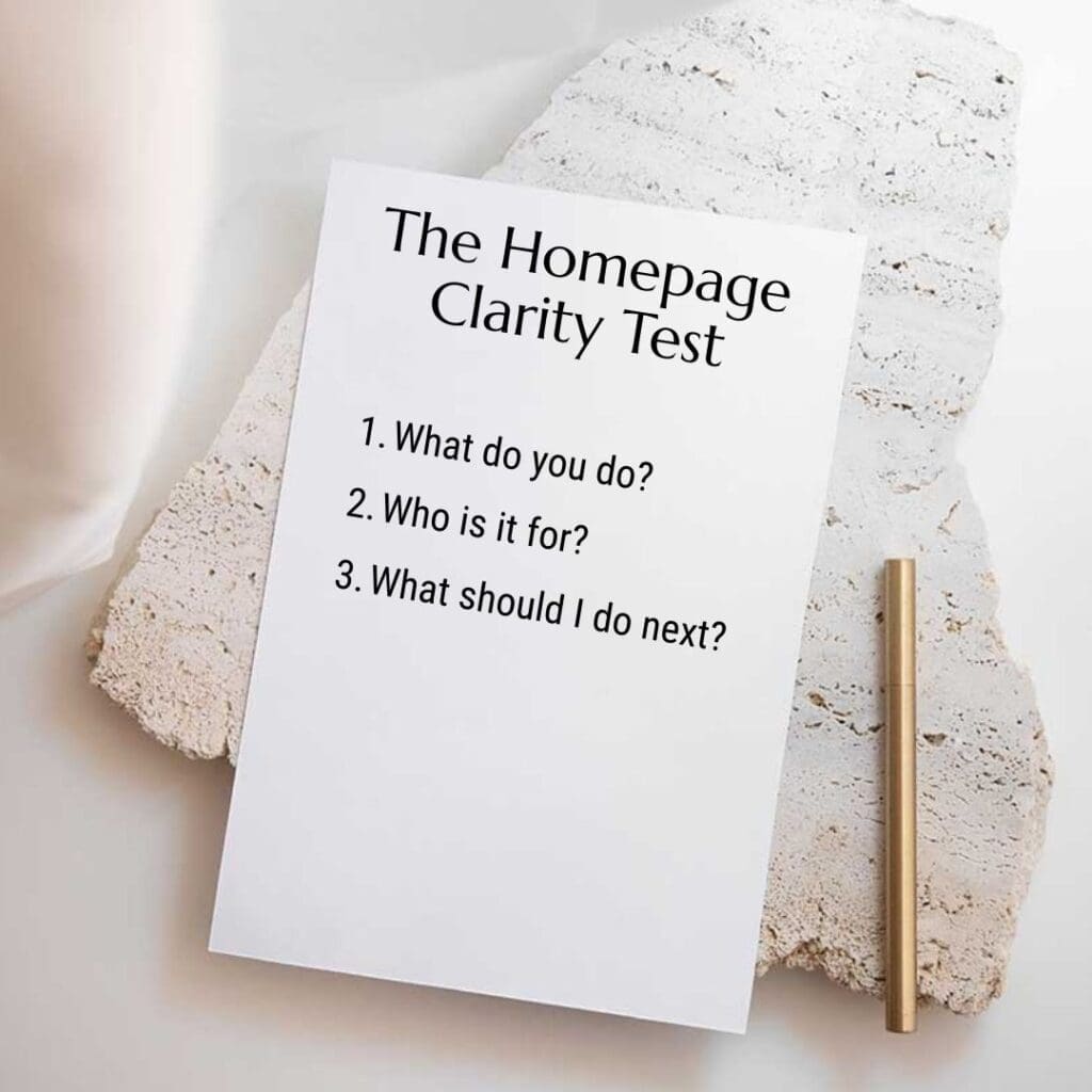
And when your homepage feels unclear, people don’t reach out. They scroll, hesitate, and leave—often because they can’t quickly answer three simple questions:
- What do you do?
- Is this for me?
- What should I do next?
The good news: you don’t need a complete redesign to fix this. In many cases, you need a better homepage section order—one that matches how people make decisions online.
In this post, I’ll walk you through a conversion-first homepage design structure (built specifically for service-based small businesses), plus common ordering mistakes and a quick checklist you can use today.
Why section order matters more than “pretty design”
Homepage design isn’t just visual styling. It’s a guided experience.
When your sections appear in a thoughtful sequence, your homepage does three things consistently:
- It builds trust quickly (before someone gets impatient).
- It creates clarity (so visitors don’t have to “figure you out”).
- It moves people toward action (without feeling pushy).
However, when the order feels random—or worse, centered on aesthetics instead of intent—your visitors have to work harder. And when people have to work harder, they rarely inquire.
So, instead of asking “Does this look nice?” try asking:
“Does this page answer the right questions in the right order?”
That’s what we’re building below.
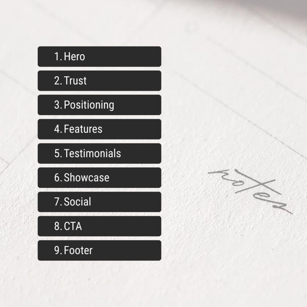
The 9-section homepage order (built for inquiries)
This structure works especially well if you’re a service provider: designer, photographer, coach, studio owner, consultant, wellness practitioner, or any business where the next step is a conversation.
You can use all nine sections, or you can simplify. Either way, keep the sequence.
1. Hero: Clear outcome + one primary CTA
Your hero section should do one job: tell people what changes when they work with you.
Aim for:
- A headline that communicates an outcome (not a vibe)
- A subheadline that clarifies who it’s for
- One primary CTA (book, inquire, apply, contact)
If you include a secondary CTA, keep it supportive—not competitive. For example:
- Primary: Inquire / Book a Call
- Secondary: View Work or Explore Services
Example hero formula:
- Headline: Websites that feel like your brand—and guide clients to inquire.
- Subheadline: For small business owners who want a calm, clear site that converts without feeling salesy.
- CTA: Enquire Now
Transition tip: For example, if your hero headline sounds poetic but vague, add one clarifying line right underneath. That single line often improves conversions immediately.
2. Trust bar: Quick proof, quickly
Right after the hero, visitors look for signals that you’re credible.
So, give them a simple “trust bar” before they scroll too far:
- client logos
- credentials
- short testimonial snippet
- “featured in” mentions
- number of years / projects (if strong)
Keep it compact. This isn’t the place for a full testimonial wall. Instead, it’s the moment for instant reassurance.
3. Positioning: The problem you solve (in plain language)
Now that visitors know what you do, you want them to feel seen.
This section should answer:
- What pain are you solving?
- What do you help people move away from?
- What do you help people move toward?
Copy prompt (simple and effective):
If you’re a [type of business] and your website feels [problem], you’re in the right place.
Then add 2–4 lines that define the transformation.
Example:
If your website looks polished but still doesn’t bring in inquiries, it’s usually not a “design problem.” It’s a clarity problem. Together, we’ll shape your homepage into an intentional path—so visitors understand you, trust you, and take the next step.
Because of this, you’re not just stating what you do—you’re making the visitor feel like your service fits.
4. Your approach: A simple 3-step method (no fluff)
This is where you reduce uncertainty.
Most visitors don’t fear your talent—they fear the process:
- “Will this be overwhelming?”
- “Will this take forever?”
- “Will I have to write everything myself?”
- “Will it feel like me?”
So, outline your method in 3 steps.
Example:
- Clarify the message (positioning + content direction)
- Design the structure (sections + hierarchy + flow)
- Refine for conversion (CTA clarity, proof placement, mobile)
This section works well with short, confident language. Meanwhile, it quietly filters out people who want a quick template flip.
5. Services snapshot: 3–5 options (scannable cards)
Now that you’ve built clarity and trust, people are ready to see how they can work with you.
Keep this section simple:
- 3–5 service cards
- each card includes: who it’s for + outcome + link to service page
Avoid listing every deliverable here. Instead, focus on the result.
Service card mini format:
- Service name
- One-liner outcome (what they get)
- “Learn more” link
6. Proof: Portfolio preview + “what changed” notes
People don’t want a gallery. They want evidence.
So, pair your portfolio preview with micro case notes:
- What was the problem?
- What did you change?
- What improved?
Even one to two lines under each project can shift perception.
Example micro note:
Before: beautiful but unclear services.
After: simplified homepage flow + stronger CTA placement.
As a result, your portfolio becomes more than visual inspiration—it becomes conversion proof.
7. Objection clearer: FAQ-lite block
This section prevents hesitation from turning into a bounce.
Choose 3–5 questions that buyers ask before they inquire, such as:
- What do you need from me?
- How long does it take?
- What platform do you build on?
- What if I don’t have brand photos yet?
- Do you help with copy?
Keep answers short. Link to a full FAQ page if you have one.
Instead of defending your process, you’re guiding the decision.
8. About: Credibility (not biography)
This “About” section doesn’t need your life story.
It should answer:
- Why do you approach design this way?
- What do you believe makes a website work?
- What kind of experience will it feel like to work with you?
If you prefer not to show your face, that’s completely fine. Focus on your philosophy and working style.
Example angle:
I design with structure first—so your website feels calm, clear, and true to your brand. That way, your visitors don’t just admire your site. They understand it.
9. Final CTA block: One decision, one next step
Your final CTA should feel like a confident invitation.
Repeat the CTA, but shift the language slightly:
- “Ready for a homepage that guides inquiries?”
- “Book a clarity call.”
- “Tell me about your project.”
Then add a short reassurance line:
- “I’ll reply within 2 business days.”
- “No pressure—just clarity.”
Finally, keep the CTA visually obvious. Don’t hide it in a wall of text.
Common homepage ordering mistakes (and how to fix them)
Even strong designs can lose inquiries when the sequence works against the visitor.
Here are the most common problems I see—and what to change.
Mistake 1: The homepage starts with vibes, not clarity
If your hero section reads like a moodboard, visitors can’t anchor themselves.
Fix: Keep your aesthetic. Add a clarifying line that states:
- who it’s for
- what you do
- what outcome you create
Mistake 2: Proof appears too late
Many homepages push testimonials and work all the way to the footer.
However, visitors look for proof early. If they don’t see it, they hesitate.
Fix: Add a trust bar near the top and a proof section before your final CTA.
Mistake 3: Services come before trust
If you list services immediately, people feel sold to before they feel understood.
Fix: Put your positioning and approach before the full services snapshot.
Mistake 4: No “objection” section
People may love your work but still feel unsure.
Fix: Add an FAQ-lite block to answer what they’re already thinking.
A 5-minute homepage checklist (use this today)
Open your homepage and scan it quickly. Don’t overthink—answer honestly.
- Can a visitor understand what I do in 5 seconds?
- Is it obvious who my service is for?
- Is there a single clear CTA above the fold?
- Do I show proof before asking for action again?
- Does my page flow from clarity → trust → action?
If you answered “no” to even two of these, start by reorganising sections before redesigning anything.
In practice, a stronger order often improves inquiries without changing your visuals at all.
Want to see these section order principles applied to a real wellness brand? View the Showit homepage transformation for Love Yoga — a complete journey from WordPress grid to editorial design that increased their inquiries by 40%.
FAQ: Homepage Section Order
A strong order starts with a clear hero and CTA, adds fast trust signals, then moves into positioning, approach, services, proof, objections, and a final CTA.
Make it long enough to answer doubts. Most service businesses need proof, process, and clear next steps—not just a hero and a services list.
Place a small trust bar near the top, then add deeper proof (testimonials or mini case notes) before your final CTA.
Summarise them, then link to dedicated service pages. That keeps your homepage clear while still giving people paths to explore.
Unclear positioning. If visitors can’t tell who it’s for and what happens next, they won’t inquire—even if your website looks premium.
Want a clearer conversion path?
If your website looks polished but still feels quiet in the wrong way, it may not be your style—it may be your structure.
👉 Start here: Why Your Beautiful Website Is Not Converting
Or, if you want a faster diagnostic: download the guide – Why Your Beautiful Website Is Not Converting
Suggested reads:
Nielsen Norman Group (homepage / usability / clarity):

Visual hierarchy / scanning (NN/g search within site):

Alternative UX resource


