
Many business owners invest heavily in branding and web design, only to feel frustrated when their beautiful website is not converting visitors into enquiries.
The site looks polished.
The visuals feel refined.
The brand appears professional.
Yet visitors scroll, hesitate, and leave.
In most cases, the problem isn’t the way the website looks.
It’s the way it’s structured.
A website not converting is often a clarity problem — not an aesthetic one. This is exactly what I mean by intentional web design — structure before decoration.
Why a Beautiful Website Is Still Not Converting
A website can be visually pleasing and still underperform when it asks visitors to make too many decisions at once.
Common reasons a website not converting include:
- Multiple messages competing for attention
- Several calls to action presented simultaneously
- Long explanations without visual hierarchy
- Pages that inform, but don’t guide
When everything feels equally important, visitors are forced to decide what to do next on their own. For many, that decision becomes inaction.
Conversion doesn’t come from stronger persuasion.
It comes from reducing friction.
The Hidden Reason Your Website Is Not Converting Visitors
Most websites are built with good intentions:
- To explain the full offering
- To share the brand story
- To showcase everything available
But without structure, this creates cognitive overload.
When visitors must:
- Read too much before understanding the offer
- Compare multiple options without guidance
- Interpret what matters most
the experience becomes effortful.
And effort is where conversion drops.
A website not converting visitors is often one that asks them to work too hard too early.
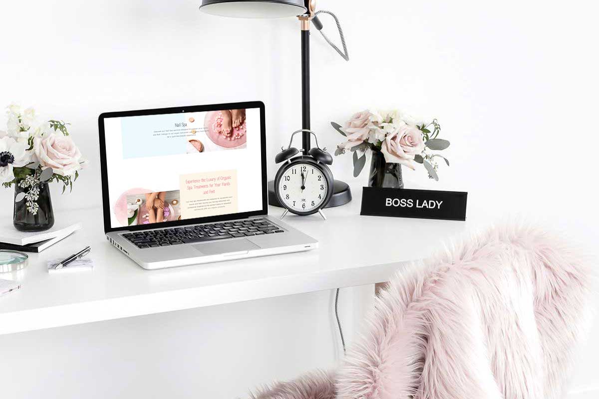
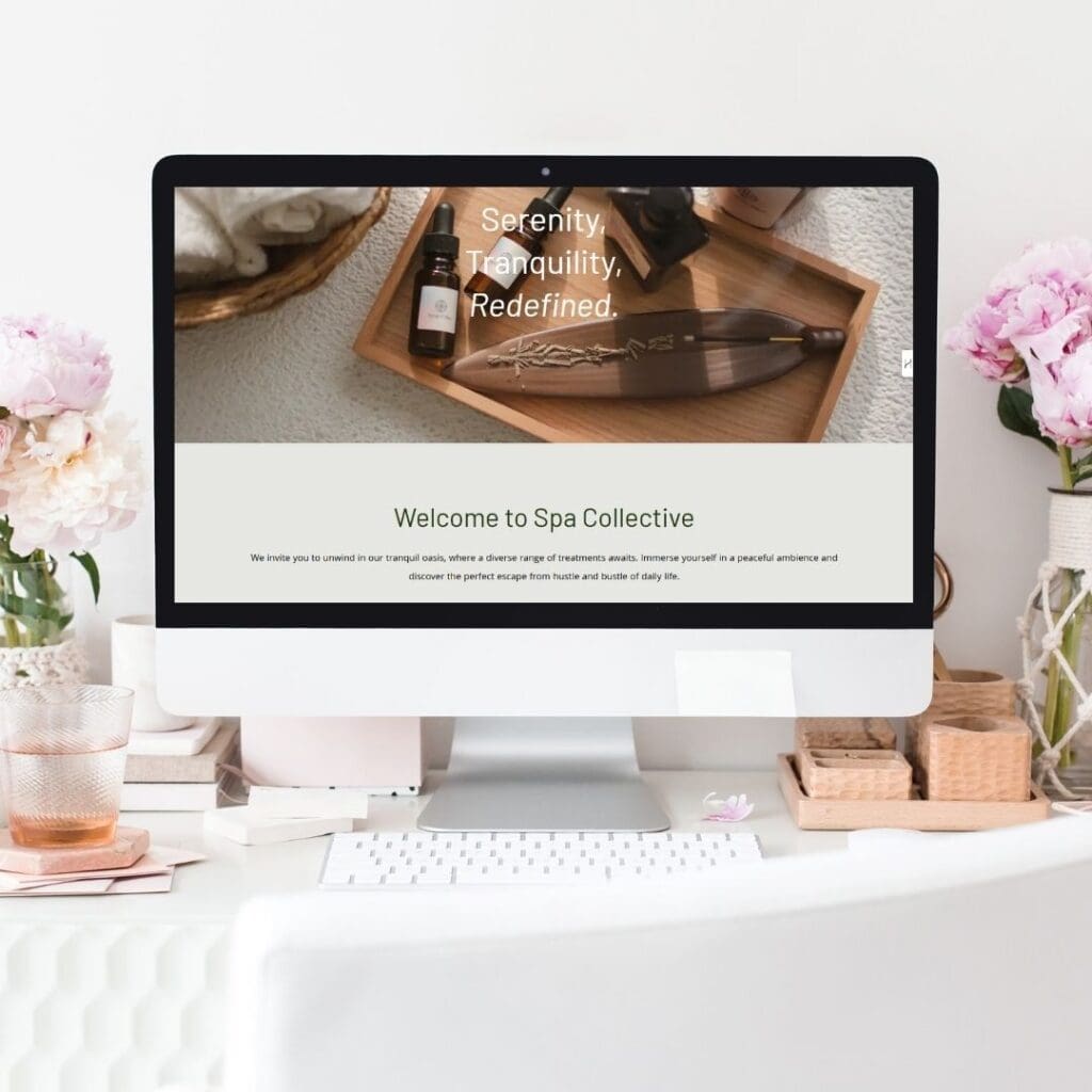
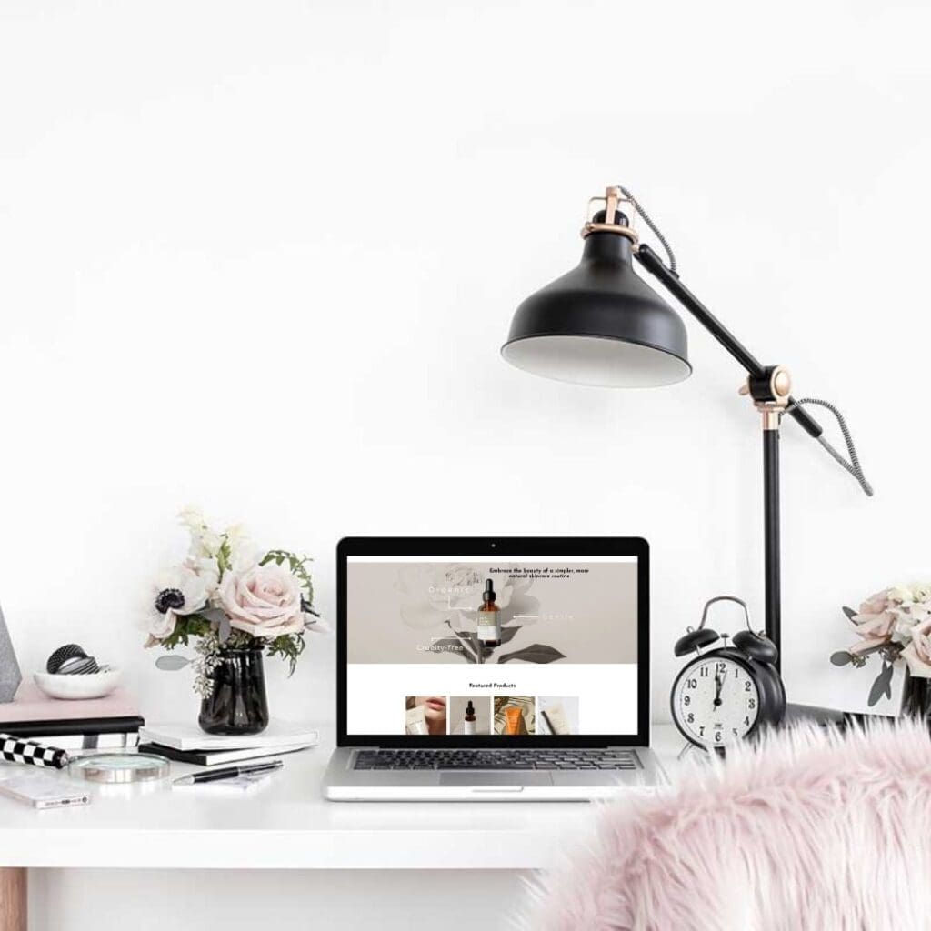
A Real Homepage Transformation: Why Structure Matters
To demonstrate why a website not converting has less to do with design quality and more to do with clarity, I documented a homepage transformation for a fictional wellness studio.
Both versions were built on the same platform.
The content scope did not expand.
No marketing tactics were added.
What changed was the structure.
Instead of trying to communicate everything at once, the redesigned version focused on:
- One clear message in the hero section
- A prioritised service offering
- A single, confident next step
The result wasn’t a louder website — it was a clearer one.
And clarity is what allows conversion to happen.
What Changed When the Website Started Converting
When a website not converting is redesigned with intention, the changes are often subtle — but impactful.
1. One message at a time
Each section answers one question instead of several.
2. One action at a time
Visitors are guided instead of overwhelmed with choices.
3. Space used as structure
White space creates rhythm and focus, not emptiness.
4. Design supports decision-making
Visual hierarchy leads attention before copy convinces.
This is what Designs That Breathe means in practice —
not minimal design for aesthetics, but structure that reduces friction and supports conversion.
Signs Your Website Is Not Converting (Even If It Looks “Fine”)
If your website not converting feels familiar, you may recognise these signs:
- Enquiries are inconsistent or low quality
- Visitors spend time browsing but don’t act
- The site feels crowded despite a clean aesthetic
- Your business has matured, but the website hasn’t
In these cases, the solution is rarely more content or stronger calls to action.
More often, it’s clarity.
Explore the Website Transformation Guide
I’ve documented this homepage transformation visually — including before-and-after comparisons — in a short guide created for founders who want to understand why a website not converting is often a structural issue.

View the website transformation guide →
This guide is designed for wellness, beauty, and lifestyle brands who value intentional growth over quick fixes.
Conclusion
A website not converting does not need more urgency.
It needs more clarity.
When a website is designed to guide rather than explain, visitors don’t need to be persuaded — they know where to go.
Beautiful design attracts attention.
Clear design earns action.


